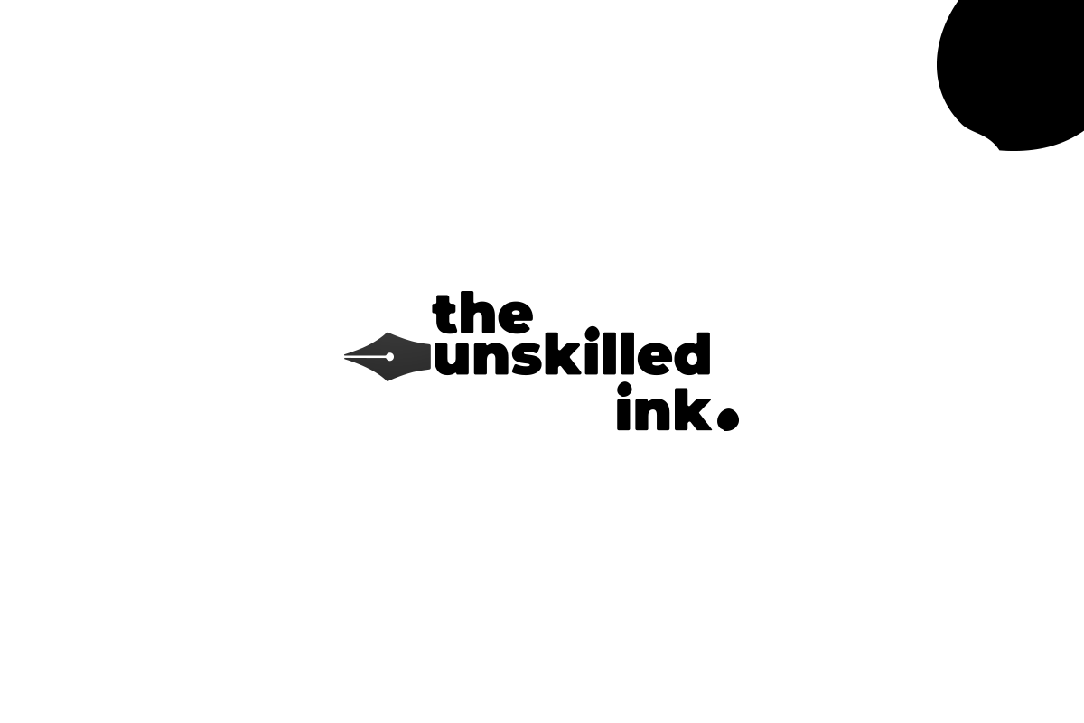
Workflow began with drawing concepts for the logo. The founden pen design inspiration was used to create the logo. The ink splash was used in the character “I” and at the end of the ink to give depth and proportion. The character corners were rounded to give an elegant look to the logo, to connect with the brand emotion.
Tuink, evolved from the unskilled ink, the founder pen design was integrated to give a feminine touch to the design.


